
Introduction
Welcome to the enhanced.io brand guidelines. Everything you need to represent the enhanced.io brand correctly across your marketing materials, proposals, and client communications.
These guidelines help MSP partners and vendor partners use our logo, colors, and messaging consistently. Download assets directly or reference the specifications below.
Logo usage
The enhanced.io logo represents full spectrum security. Use it consistently to maintain brand recognition across all partner materials.
Primary logo
Use the full-color logo with white out text on dark backgrounds. This is the preferred version for most applications.
Logo variations
Full color (dark background): Primary version for websites, presentations, and dark materials
Reversed (light background): For use on white or light-colored materials
Icon only: For favicons, app icons, and small spaces where the full logo won't fit.
Clear space
Maintain a minimum clear space around the logo equal to the height of the icon mark. This ensures the logo remains legible and uncluttered.
Do
Use the logo files provided in the downloads section
Maintain the minimum clear space around the logo
Place on backgrounds with sufficient contrast
Don't
Stretch, distort, or rotate the logo
Change the logo colors
Add effects, shadows, or outlines
Place on busy backgrounds or photos without a solid color block
Recreate or approximate the logo using other fonts or shapes
Color palette
Our color palette balances technical authority with modern energy. Deep Navy anchors the brand, while Teal and Magenta provide accent and emphasis.
HEX: #00132D
RGB: 0, 19, 45
Usage: Backgrounds, headers, primary brand color
HEX: #22D3C4
RGB: 34, 211, 196
Usage: CTAs, highlights, success indicators
HEX: #E11D74
RGB: 225, 29, 116
Usage: Accents, alerts, secondary emphasis
Typography
Our typography is clean and modern, prioritizing readability across digital and print applications.
Dwight is our preferred brand typeface. It is used for headings, key statements, and brand-led moments where character and authority matter.
Inter is used alongside Dwight for body copy and UI elements. It is chosen for its clarity, performance, and broad platform support across web and product interfaces.
Primary typeface
Dwight
Inter
Dwight is a licensed typeface used for brand-led headings and key statements. Font files are not distributed as part of this brand guide. Approved partners or vendors requiring access should contact enhanced.io directly.
Dwight must not be used for long-form body copy, dense UI layouts, or functional interface text. Inter should be confirmed as the default typeface in these contexts.
Fallback fonts
When Dwight is unavailable, fall back to Inter first. If neither is available, use system fonts in the following order to maintain consistency and performance:
Inter
Helvetica Neue
Arial
Sans serif
Inter
Aa
Helvetica
Bb
Arial
Cc
San Serif
Dd
This approach ensures fast loading, broad compatibility, and minimal visual shift across devices and operating systems.
Usage guidelines
Heading style
Use heading styles consistently to create a clear and predictable hierarchy. Avoid skipping levels. This helps scanning, accessibility, and layout rhythm.
Size
Spacing
Limit
Header with Dwight
Body in Inter
Contrast
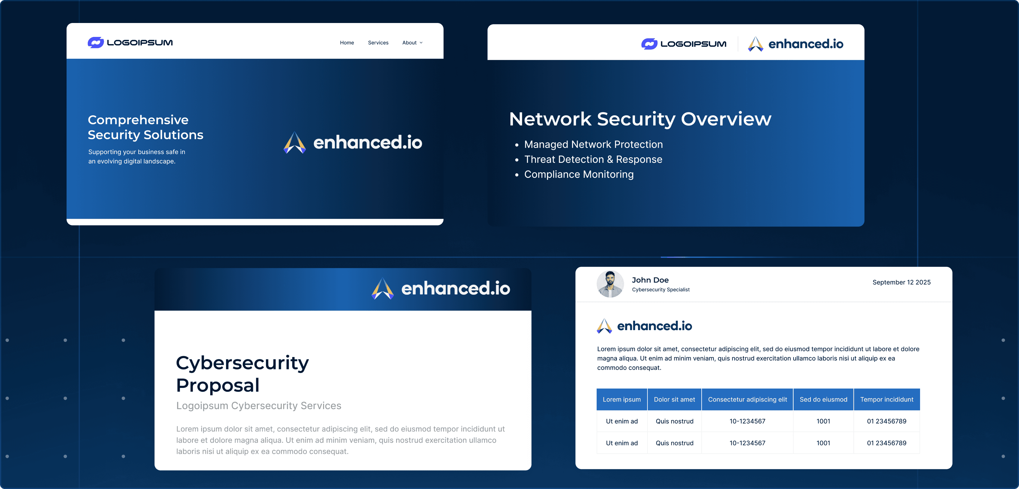
Partner co-branding
As an enhanced.io partner, you can use our brand alongside yours to demonstrate your security capabilities. These guidelines ensure professional, consistent co-branding across all partner materials.
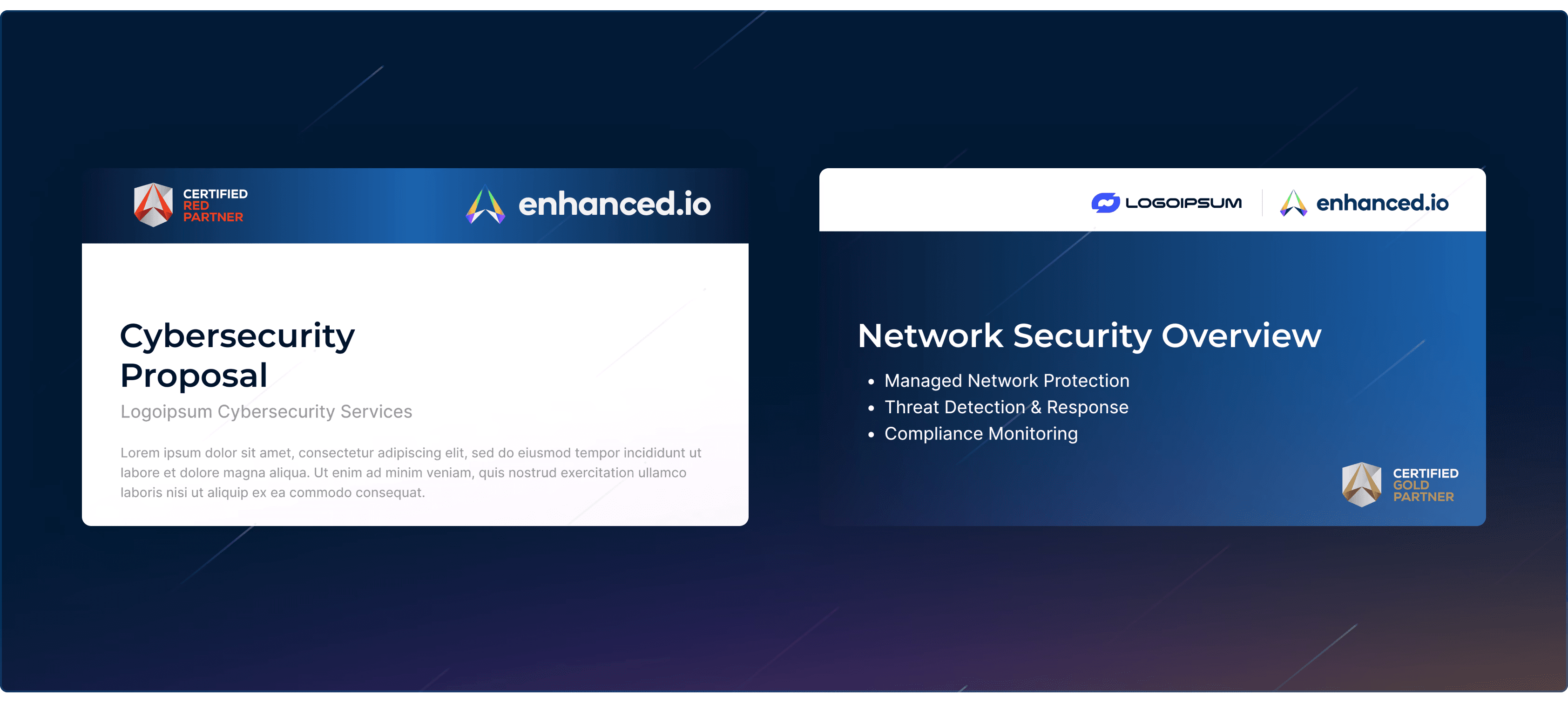
Certified Partner logos
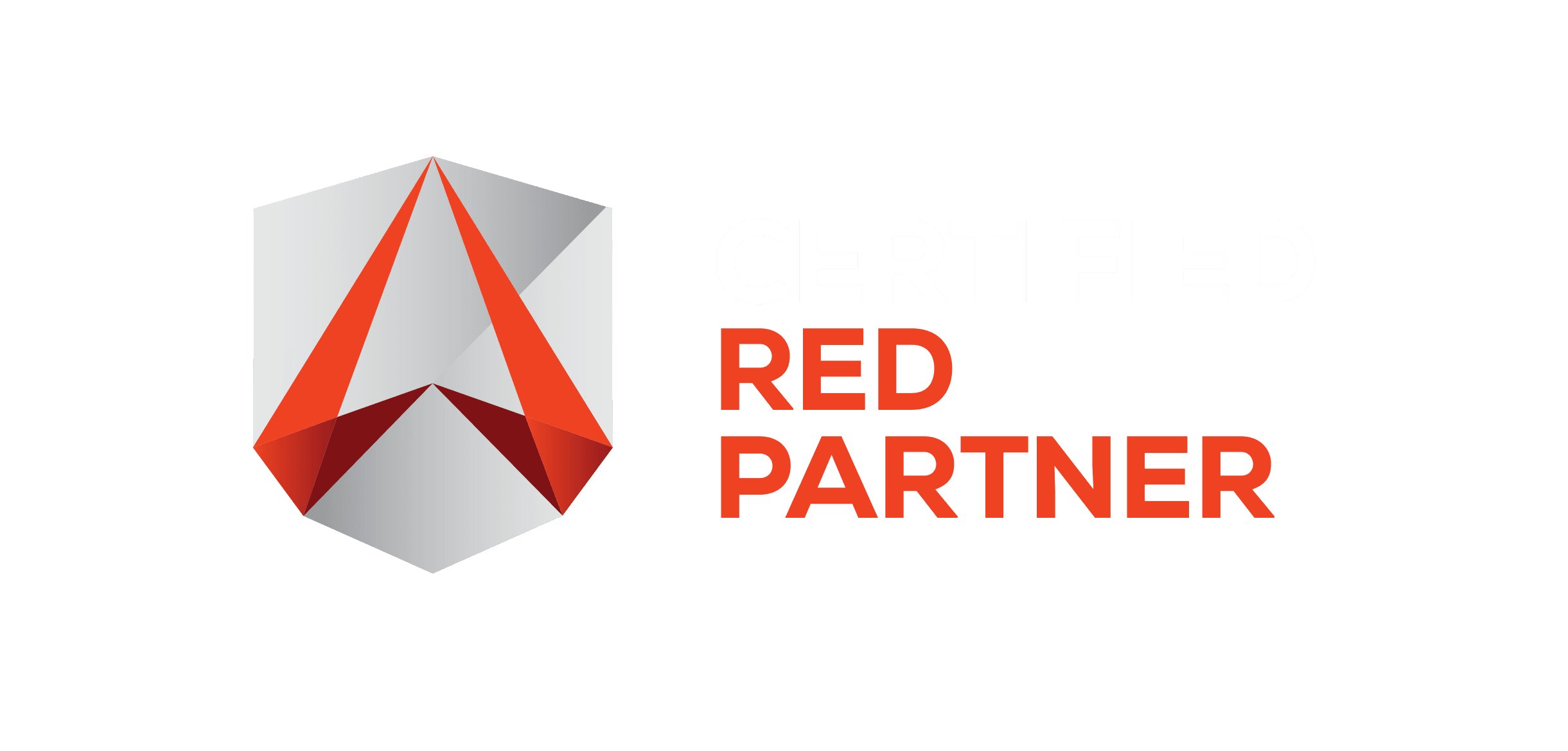
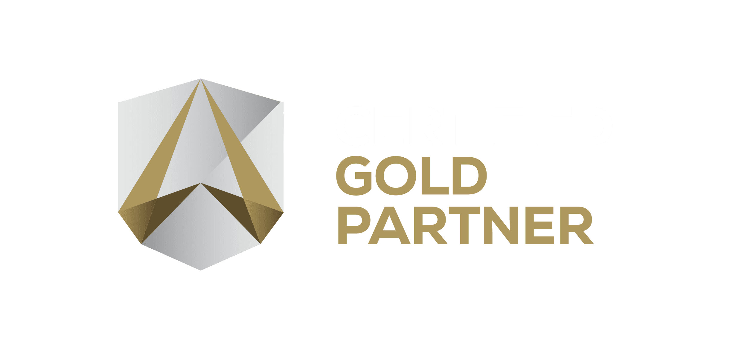

The enhanced.io Certified Partner logos signal to your clients that you are an approved delivery partner for enterprise-grade security services, backed by enhanced.io’s 24/7 SOC and Fractional Security Director capabilities.
These logos are intended to reinforce credibility, capability, and alignment with enhanced.io delivery standards. They may only be used by authorised partners in accordance with the guidelines below.
Where to use certified partner logos
Website footer or dedicated partner page
Proposals, pitch decks, and sales presentations
Email signatures for customer-facing roles
Approved marketing materials and brochures
Where not to use certified partner logos
Usage rules
Partner status and removal
Logo lockups
When featuring both your logo and the enhanced.io logo together, use our approved lockup templates. These ensure proper spacing and visual hierarchy.
Available lockup formats:
Horizontal: Partner logo + enhanced.io logo side by side
Stacked: Partner logo above enhanced.io logo
"Powered by": For materials where enhanced.io provides backend services
Horizontal
Stacked
“Powered by”
powered by
Do
Use the provided lockup templates
Maintain equal visual weight between partner and enhanced.io logos
Use approved language when describing the partnership
Don't
Create custom lockups without approval
Imply enhanced.io endorsement of unrelated services
Use the enhanced.io logo larger than your own in co-branded materials
Messaging and terminology
Consistent terminology helps clients understand what they're getting. Use these approved terms when describing enhanced.io services in your materials.
Brand name
Always write "enhanced.io" in lowercase, even at the start of a sentence. Never "Enhanced.io" or "ENHANCED.IO".
Key terms
Term
How to use it
Fractional Security Director
A CISSP-certified security expert assigned to guide strategy and reporting. Capitalize as shown. Not "virtual CISO" or "vCISO."
Human-led SOC
24/7 monitoring by real analysts, not just automated alerts. Not "manned" or "staffed."
Full spectrum security
Coverage across endpoint, network, cloud, identity, IoT, and OT. Not "full-stack" or "comprehensive."
Open XDR
Vendor-agnostic platform with 400+ integrations. Hyphenate when used as adjective: "Open-XDR platform."
Boilerplate copy
Use these approved descriptions when you need standard copy about enhanced.io:
Short (one line):
enhanced.io is a cybersecurity delivery platform combining 24/7 SOC operations, vulnerability management, Fractional Security Director leadership, and integrated detection and response.
Medium (two sentences):
enhanced.io enables enterprise-grade cybersecurity delivery through 24/7 human-led SOC operations, continuous vulnerability management, Fractional Security Director oversight, and an open XDR platform with broad third-party integrations. It provides end-to-end security visibility across endpoints, identities, networks, and cloud environments, supporting real-world operational security at scale.
Downloads
Download the assets you need for your marketing materials, proposals, and client communications.
Asset packages to include:
Package
Content
Complete brand kit
All logos, Certified Partner badges, color swatches, and typography specs in one ZIP
Logo files
Primary, reversed, and icon versions in PNG, SVG, and EPS
Certified Partner badges
Certified partner logos in PNG and SVG
Need something custom?
For custom co-branding requests, event materials, or questions about using the enhanced.io brand, get in touch with our team.

Talk to us about adding smart building and OT security to your portfolio. We'll show you exactly how it works and what it takes to get started.
Book a call